ShopDreamUp AI ArtDreamUp
Deviation Actions


Suggested Deviants


Suggested Collections
![[E.C.] Gumina Glasserd](https://images-wixmp-ed30a86b8c4ca887773594c2.wixmp.com/f/30992409-460c-4e86-a340-e717233e9e01/d8h8ds6-bae51856-4c5e-4f0f-abeb-b43e3c8ba014.png/v1/crop/w_184,h_184,x_0,y_19,scl_0.080279232111693,q_70,strp/_e_c___gumina_glasserd_by_matryoshka_ruth_d8h8ds6-92s-2x.jpg?token=eyJ0eXAiOiJKV1QiLCJhbGciOiJIUzI1NiJ9.eyJzdWIiOiJ1cm46YXBwOjdlMGQxODg5ODIyNjQzNzNhNWYwZDQxNWVhMGQyNmUwIiwiaXNzIjoidXJuOmFwcDo3ZTBkMTg4OTgyMjY0MzczYTVmMGQ0MTVlYTBkMjZlMCIsIm9iaiI6W1t7ImhlaWdodCI6Ijw9MTgxNyIsInBhdGgiOiJcL2ZcLzMwOTkyNDA5LTQ2MGMtNGU4Ni1hMzQwLWU3MTcyMzNlOWUwMVwvZDhoOGRzNi1iYWU1MTg1Ni00YzVlLTRmMGYtYWJlYi1iNDNlM2M4YmEwMTQucG5nIiwid2lkdGgiOiI8PTEyODAifV1dLCJhdWQiOlsidXJuOnNlcnZpY2U6aW1hZ2Uub3BlcmF0aW9ucyJdfQ.4-sDMGgA2bnwyMrIxC2NJaZKmL_u9QjXcHyTQha6vvM)
![[E.C.] Gumina Glasserd](https://images-wixmp-ed30a86b8c4ca887773594c2.wixmp.com/f/30992409-460c-4e86-a340-e717233e9e01/d8h8ds6-bae51856-4c5e-4f0f-abeb-b43e3c8ba014.png/v1/crop/w_92,h_92,x_0,y_10,scl_0.040139616055846,q_70,strp/_e_c___gumina_glasserd_by_matryoshka_ruth_d8h8ds6-92s.jpg?token=eyJ0eXAiOiJKV1QiLCJhbGciOiJIUzI1NiJ9.eyJzdWIiOiJ1cm46YXBwOjdlMGQxODg5ODIyNjQzNzNhNWYwZDQxNWVhMGQyNmUwIiwiaXNzIjoidXJuOmFwcDo3ZTBkMTg4OTgyMjY0MzczYTVmMGQ0MTVlYTBkMjZlMCIsIm9iaiI6W1t7ImhlaWdodCI6Ijw9MTgxNyIsInBhdGgiOiJcL2ZcLzMwOTkyNDA5LTQ2MGMtNGU4Ni1hMzQwLWU3MTcyMzNlOWUwMVwvZDhoOGRzNi1iYWU1MTg1Ni00YzVlLTRmMGYtYWJlYi1iNDNlM2M4YmEwMTQucG5nIiwid2lkdGgiOiI8PTEyODAifV1dLCJhdWQiOlsidXJuOnNlcnZpY2U6aW1hZ2Uub3BlcmF0aW9ucyJdfQ.4-sDMGgA2bnwyMrIxC2NJaZKmL_u9QjXcHyTQha6vvM)


You Might Like…


Featured in Groups


Description
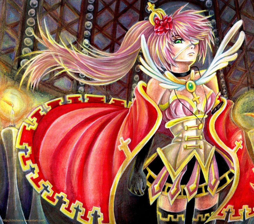
This artwork is for enzouke 's OC Contest!
I really love the character design so yeah I chose her~
I used poster paints and colored pencils.
Unnamed OC belongs to

I really love the character design so yeah I chose her~
I used poster paints and colored pencils.
Unnamed OC belongs to
Image size
1220x1077px 727.8 KB
Comments32
Join the community to add your comment. Already a deviant? Log In
going through your work so far i get it your strong points are your color variations and the beauty of your work really gets some points for it there but don't take my comments the wrong way the intentions of what i critique are purely constructive and in no way do i mean to offend. you really have to watch what you are doing. the anatomy is, well honestly set, it is wrong. her waist should not be as tiny as it is if her corset is as loose as it looks because of the folds you put on it. try googling up images of corsets, if you intend it to be a corset that serves to shrink the waist it would have a hard frame. The waist is the first issue on her anatomy that caught my eye, here is the second: her legs. what little of her legs is shown, i suppose only her thighs. the further leg, her left leg, the leg we see to the right is not shaped like a leg but a bent sausage which is thinner than the other leg. I'm really going to cover all that I see wrong, again i do not intend to offend this is honestly for your development as an artist and don't find my critiques unreliable because it comes from an artist that may not be as popular you seem to be... Okay so I should proceed with this critique without feeling guilty by the chance that i may offend you. Her neck isn't just a cylinder attache to her head. her shoulders look stiff rather than broad, the left shoulder is uneven compared to the right no matter what angle it is taken. her hands can take some working on-try practice sketches for hands in your spare time.
Out of the category of anatomy the cape's flow is also... wrong, do not sacrifice the flow to put show in tell for the pattern on the ends of the cape, the pattern may be even more justified if it would ruffle with the rest of the cape unless it is a metal frame forced into that position-in that case there shouldn't be any folds there at all.
For the air flow that is shown only to go one way for the candles but it goes all ways for everything else. maybe its another thing you want to defy for presentation but if you really wish to do so please do it subtly.
Lighting, the colors you used are beautiful but if you do express the lighting better the beauty of it will increase. the light sources are from the candles, yes? then there should be multiple shadows cast over what is behind something
i may have not done well with wording you could ask me about it if i didnt make as much sense as i thought i would